Maisie Hitchins – The Case of the Weeping Mermaid

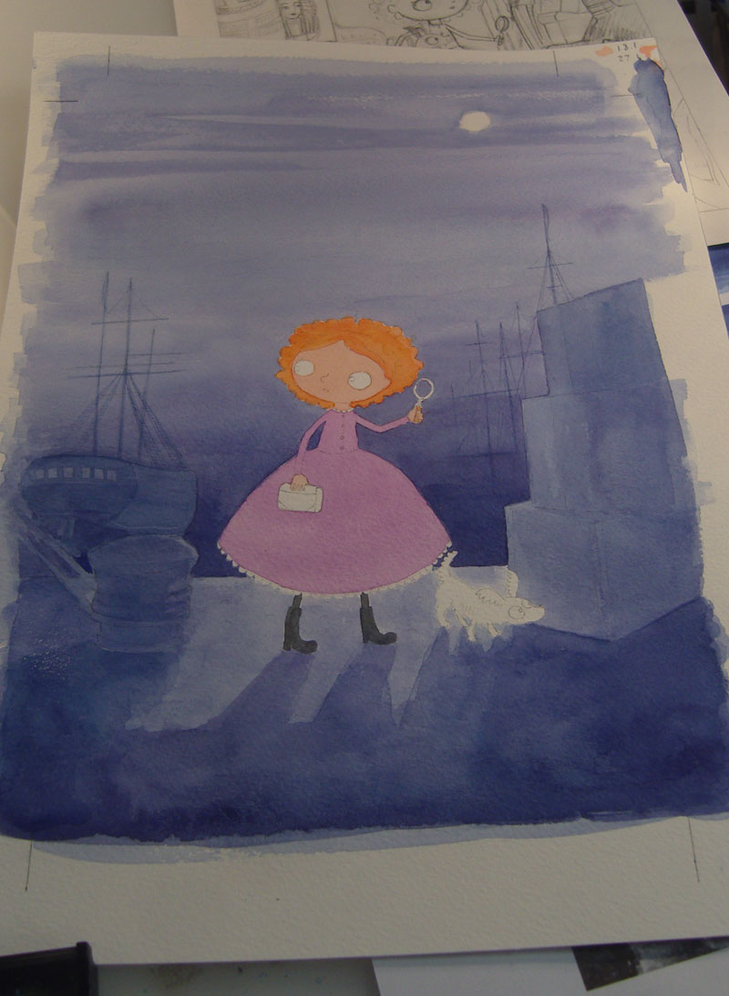
May saw the launch of the last story in Holly Webb‘s wonderful mystery series Maisie Hitchins. This book is called The Case of the Weeping Mermaid and its action centres around dark and mysterious London docks which were the perfect setting for a front cover. I took photos as I was painting the cover so that I would later remember the different stages and here they all are below from the sketchiest beginnings to the final scan. I always find it challenging painting covers, they seem to go through a lot of different stages and look fairly awful for most of the time until suddenly at the end it all comes together – always a bit of a relief!

Here is the sketch for the cover ready to be transferred onto watercolour paper, as you can probably see I changed my mind about how the clouds were going to look!
Here is the cover all drawn out on watercolour paper and I've just begun painting with the most important bit - Maisie!
Here is the cover all drawn out on watercolour paper and I’ve just begun painting the most important bit – Maisie! As you can see the sketch is to hand and I’m working in acrylic ink. There is a lot of empty space here which is to allow for the title and Holly’s name which will come later.
Here you can see the monotone background is beginning to appear, everything is still quite pale.
I've kept on working into the background to boost the colour and tone and to strengthen the shadows, and Maisie is getting more vibrant too.
I’ve kept on working into the background to boost the colour and tone and to strengthen the shadows, clouds are beginning to appear and Maisie is getting more vibrant.
Now the cover is nearly finished; I've added highlights to give the feel of moonlight and everything has an outline to bring it all into sharp focus.
Now the cover is nearly finished; I’ve added highlights to give the feel of moonlight and everything has an outline to bring it all into sharp focus.
Here is the finished image, scanned this time. The tendrils of mist were the last thing to arrive, they were made by painting dilute white acrylic ink over the top of the painting.
Here is the finished cover as it looks with all the text in place - what a difference!
Here is the finished cover as it looks with all the text in place – what a difference!

Watercolour and FW ink love

I have been away from my studio recently and travelling light with just my tiny water colour set to keep me company. I had forgotten how lovely water colour is and how different it is to acrylic ink, which is what I use most of the time for illustrations. I love both mediums in different ways; FW inks are incredibly vivid and very versatile, but water colour has a beautiful quality to it. The colours are subtle and each one seems to settle on the page in a slightly different way. I am by no means an expert but I do like to play – here are some patterns I’ve been working on, the first three were painted with water colour and the ones beneath that are FW ink.

House and Bat pattern

P-P repeat

pets

jellyfish and seaweed

Fishies

Website Powered by WordPress.com.

Up ↑